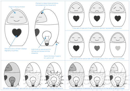
Silka
Internet, meet Silka – a smile sharing device for people living apart.
Silka is a sociable creature. She likes company; when someone’s around, she wakes up. When someone touches her, she smiles. And when one Silka is happy, her twin is happy too.
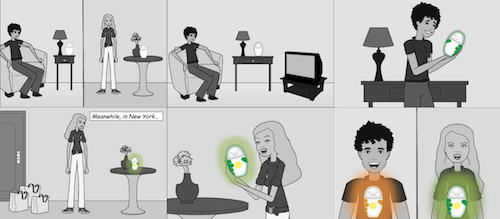
Silka was born in November as a part of a university project. Our group (me, Jennifer, Jesper, Kio, and Robert) had to design some sort of a domestic technology and since we all were communicating in one way of another with family and friends who lived away – in different cities, different countries, on different continents – we focused on communication.
Research
First, we did what students usually do – we posted a short survey on Twitter and Facebook. We wanted to find out how people communicated with their family and friends, how often, what modes of communication they used and how they shared pictures. We then interviewed a few people and asked them similar questions, but this time we also wanted to know whether they thought about the family, how happy they were with the frequency of communication, and how they felt when they didn’t have time for a call.
Additionally, we looked around people’s homes to better understand how they stored memorable objects, and reviewed existing remote presence projects for inspiration and to see what else was out there.
Design
Next, we moved to sketching. My main idea was heavily influenced by my tablet research and I’m glad we’ve dropped it – why would anyone be interested in an interactive photo frame? Other ideas were quite unique though, and included a heat sensitive sticker that transmits hand prints and short messages, a plinth with a glass screen that adds interactivity to memorable objects, and a “robot doll” that sends pictures:
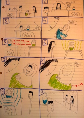
We loved those ideas (well, except for my photo frame… But hey, I couldn’t get that thing out of my head – that’s what happens when you spend too much time thinking tablets!) and decided to test them.
We grabbed a bunch of people and showed them rough sketches. As expected, the frame idea had to be discarded (“why not just buy Grandma an iPad?” – see? tablets!). The plinth idea also didn’t work: apparently the pedestal was robbing memorable items from their intimacy. However, people actually liked the other two ideas: the sticker would be great on a fridge and the doll resembled a Russian Matryoshka doll so seemed to be a good idea for a gift.
As a result Robert designed another version of our robot doll:
We returned to some of the users with the new design to ask for further feedback. Responses varied from super-excited (“I want one for all my kids!”) to rather negative (“why the hell would I want this dust-gatherer?”), but again the positive comments came from our target group (parents) and the negative ones from geeks with no feelings. And because of that the final version was even cuter:
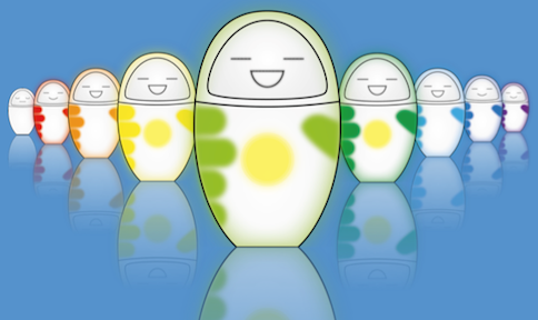
She’s cute, isn’t she? I can’t stop smiling every time I see her. Every. Single. Time.
Functionality
So, how does she work?
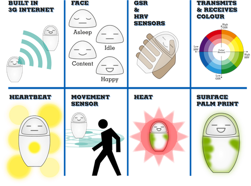
Main features include:
- Paired Silkas communicate over 3G network.
- The face describes various states of activity.
- Biometric sensors measure galvanic skin response and heart rate variability, and the results are used to pick a colour. For example, someone who has just woken up will send a different colour than someone who’s just returned from a gym.
- Some activity states are accompanied by pulsating heartbeats.
- It has a built-in movement sensor that allows her to wake up when someone is near.
- It also has a built-in heater that makes her warm.
- The body shows a print of a palm when the twin device has been touched.
Achievement unlocked
We have written a paper based on the project and submitted it to CHI 2012 Student Design Competition. As it turned out last week, the paper has been accepted. Yay!
If you don’t mind academic writing style, you can download the paper [PDF]. It’s basically what I’ve written here but with fancy words, more details and a few different pictures.
UPDATE: We’ve built an Arduino prototype:
~Falka, 18 February 12
Powered by Textpattern. Design by Falka. 2010-2026.

