Posture Analyzer
When you don’t do any UX stuff at work, you need to find something for you or work on side projects – that’s what I’ve been told by my IAI mentor and that’s what I’ve been trying to do. So when I realized that IHFE was running an app competition I had no choice but accept the challenge. I didn’t expect to win and I was more interested in putting the theory into practice and learning about the app design the hard way. After all, it’s always better to make mistakes during a side project than during an actual one.
I’ve learned a few things:
- you can’t design things alone – bouncing your ideas off others helps to see things you would miss and stops idiotic ideas
- when designing for a particular platform, talk with a developer who knows it – you will know what’s feasible
- read design guidelines for that particular platform (to avoid embarrassment when talking to a developer)
- it’s not personal – if things are wrong with your app, they are wrong with your app; you’re not stupid, really, so keep sketching
…and I also won the competition (yay!). So here’s a bit about my app and how I got to the final design.
Posture analysis…?
First thing was the theme. The competition defined it as
a new mobile app that would be of value to ergonomists and human factors professionals
and if I didn’t work on my MSc project over the summer I’d probably have a hard time coming up with an idea. But I did some posture analysis and got bored while doing it. Don’t get me wrong, I find the idea amazing and love it, but if you had over a dozen of photos and had to click your way through an online posture risk calculator, you would fall asleep as well. So I decided to design a little app that would make the whole experience a little more fun.
Research
I’m more a researcher than a designer, so jumping into the design without spending too much time researching things first was a new thing and I feel bad about it. I did read a bit about posture analysis and I did some actual analysis over the summer, but I didn’t feel confident. But I didn’t have time to do proper research, so I just asked a question on the IEHF’s linkedin forum hoping that responses would be relevant. I decided to treat myself as a target audience, but wanted to make it useful for others as well.
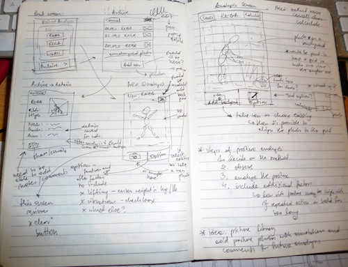
Sketching here, sketching there
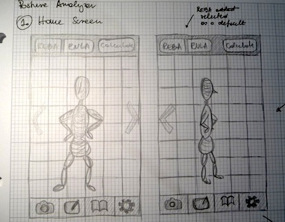
Most of my sketching was done in my head. Yes, I am aware that’s not a good thing. I put the initial idea on paper first, but most of refining was done while I was thinking about it and arguing with myself over some details.
By the time I got to updating my sketches, I had gone through 3 or 4 revisions in my head. And then I realized I didn’t know what I was doing.
While I did talk to an iPhone developer to learn what was possible and what wasn’t, I didn’t mention any UI designs before. After all, I’ve been using iPhones for a while now, of course I know how it all works. Well, wrong. Realizing I was breaking all possible guidelines wasn’t a nice thing. Realizing that a revised version was still wrong was even worse, so in the end I just sat down and read Apple’s HIG (not the whole thing though, just the part about iOS UI elements). As a result I had to change my designs, rethink some things and even change functionality to make things work. It was a painful and annoying process, but I learned a lot.
Tools
After sketching on paper I started “digitalizing” my sketches in OmniGraffle, and as a result spent half a night searching for stencils and procrastinating. And when a specific control was missing, I found myself wondering how I could change the design to use the controls I had instead of hunting for a right control. Worst possible approach.
After that I decided that stencils were too limiting and installed XCode. Installing a 10GB beast on a laptop with only 3GB of free space was challenging. I managed to do that, although I’m still not sure how. Prototyping with XCode was fun until I decided to add a ‘back’ button to a screen I was designing… I’m still using Snow Leopard for no particular reason so the latest version of XCode I could use was 3.6. And because of that I wasn’t able to simply add ‘back’ buttons in the UI builder. I needed to write some code, but I didn’t want to do that – the time was running out and besides I haven’t written a single line of code in the past 2 years. So I downloaded Balsamiq. Yes, I was desperate at this point.

But, but… What does it do?
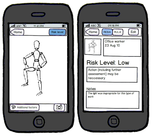
So, the app. It would be good to finally explain what it actually does. In short: the app makes posture analysis fun and simple.
The main features include:
- a 3D model that can be manually manipulated to mirror the posture that’s being analysed
- a photo analysis – the killer feature and something I would love to have: an analyst takes a photo, draws a stick person on top of it to highlight where all the limbs are and the app automagically turns that into a 3D model that can be tweaked further
- it automatically calculates risk levels using a bunch of techniques (REBA and RULA as a default, OWAS and others could be added later)
- based on the model, the app automatically selects which technique’s results would be shown first (REBA for most of the postures, but RULA for sedentary positions).
And that’s it. Now it would be good to do some proper user research, test the prototypes, and develop the app. (Wishful thinking in progress.)
~Falka, 24 November 11
Powered by Textpattern. Design by Falka. 2010-2026.


