Playing with cardboard
Back in December I had a pleasure to attend the Design Experience 1 module at UCL. I know I sound like a hopeless nerd who’s really happy to go to school, but that’s true – I really enjoyed it. The module was a hands-on follow-up to the Ergonomics for Design module and it looked like a Design Jam stretched over two weeks: there were teams and a design challenge they had to tackle. In this case teams were predefined and I actually liked it more than the way team formation was handled during the last Design Jam in November 2010, but I digress.
As it was all about physical ergonomics, each team had to design and build a mock-up of a self-service kiosk. My group’s assignment was a machine allowing to buy stamps and post letters and small parcels either within the UK or overseas. To make things more complicated we were told the client wanted to have the machine installed on the counter. First we thought it was insane as obviously a stand-alone terminal was a better solution, but I must admit that the biggest constraint in the end turned out to be the selling point of our design. If you don’t have what you like, you must like what you have. And make the most of it.
Research
To get started we actually spent some time planning our actions. In retrospect this turned out to be a really good decision: we focussed on the task at hand instead of jumping forward to discuss the design features (I was guilty of that – getting carried away was just too easy).
To plan the research, we used the PRET A Rapporter framework. I had never heard about it before this module (mainly because I’m a part-time student and will learn about it next year…). It’s a quite useful thing: the framework helps to focus on research and plan it carefully using a “PRET A R” mnemonic:
- P stands for Purpose of the research and helps to specify clear goals.
- R stands for Resources and helps to list all resources (people, time, etc.) and constraints, and later plan how the resources are going to be used.
- E stands for Ethical issues that need to be considered.
- T stands for Techniques that are going to be used to gather the data.
- A stands for Analysis and helps to determine how the data will be analysed.
- R stands for Reporting and specifies how the findings are going to be reported and presented.
The framework helped us to decide on techniques and we had the first two days sorted. Everyone knew what to do and it all went rather smooth. We decided to conduct contextual inquiry at a few post offices of various sizes but we didn’t have enough time to do it properly. Each of us had only a couple of hours for research and we interviewed customers, post office staff and observed how people used the self-service machines. Calling what we did a contextual inquiry is a bit overkill, but at least we did enough observations, interviews and even cognitive walkthroughs of the existing kiosk to come up with an initial list of user requirements, so it was good.
Analysis
At this point things got rather chaotic. We had a list of methods, but it felt a bit like we were trying to use certain techniques without really explaining why we needed them in the first place. Using various methods just to see how they work is fine, but it’s not a good idea if time is running out and we have do something QUICK and start building a mock-up NOW. To deal with the crisis we decided to use sticky notes and first wrote down what we wanted to achieve by the end of the week and explained why, and after that selected appropriate techniques. It sounds like an obvious thing to do, so I can’t really explain why we hadn’t done it earlier. Looks like PRET had sorted that out for us.
To understand better how people were using the existing kiosk and interacting with the post office in general we played a bit with Hierarchical Task Analysis (HTA). The technique is quite simple and helps to describe all steps required to complete a given task (e.g. buy a stamp, post a letter to France). One of its drawbacks is the fact that it doesn’t really show the whole picture and excludes all unexpected actions. To fill any possible gaps we used Failure Mode and Effects Analysis (FMEA) and ended up with a list of possible errors and recommendations. HTA and FMEA fed into our design requirements and we started sketching.
Mock-ups and fitting trials
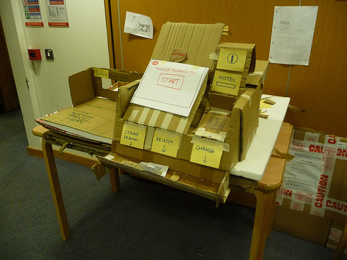
This was one of the most enjoyable parts of the project. We stole from The American Church of London’s backyard found lots of cardboard boxes on the streets and were ready to start building. The step by step process and iterations of the design can be found on Flicker.
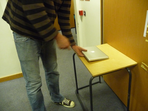
Before we started building our kiosk, we’d had to measure its dimensions, mainly the height and the angle of the screen. From the books we knew that all keys and controls used by standing workers should be placed somewhere between hip and shoulder height of a person. To make sure the terminal would be accessible to wheelchair users, we used the data from Access Prohibited? [PDF] – a really good resource, you should read it. After consulting anthropometric tables we concluded that the our device should be installed somewhere between 80 and 110 cm over the ground. But where exactly?
To find the answer we had to conduct fitting trials and test various heights with a bunch of users (5 males, 5 females). They were presented with different heights (we used a stack of tables for that) and had to tell whether the height was too low, too high, acceptable or just right for them. The table below shows the results from the height trials:

With the height selected we were able to start testing angles for the touch screen and card reader keypad. For the screen 45° turned out to be the best while for the keypad users preferred only 15° as they wanted to cover their PIN and felt more comfortable with an almost flat keypad.
Later we conducted full-dimensional trials asking users to role-play short scenes and post a parcel. Printed pages with wireframes served as a touch screen so users had a chance to go through the whole experience. (I haven’t mentioned wireframes in this post as I wasn’t involved in their creation – building and testing the mockup was simply more interesting.)
The final design was quite impressive (below) and you can compare it with the final mockup.

Summary
The whole experience was enjoyable and educating. We completed the mock-up in one week and spent the second week preparing for a role-play presentation: we were supposed to bid for tender and sell our product to the client. And we nailed it!
Those two weeks were intensive and rather stressful (I drank more coffee than in the past two years: 6 whole cups of moccachino!), but it was also fun. What’s quite surprising, it made me think about pursuing a career in ergonomics at some point in the future. But we will see if that’s just a temporary fascination or a long-term obsession.
PS. Thanks to the best team I could ever dream of: Cheng, Karren, Liina, Ian and Tali. We were awesome!
~Falka, 6 February 11
Powered by Textpattern. Design by Falka. 2010-2026.